
Showcase
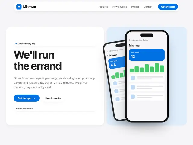
Light grey and Apple blue, the app's features in cards of different sizes and a phone in the big one.
Inter Tight · Inter
A grid of cards in different sizes
The page is a bento box: rounded cards of different sizes sitting side by side in one grid, each holding a single idea (a number, a photo, a feature, an address). Calm and orderly in the manner of Apple's pages, and a good fit for apps, products and modern cafés.
12 designs
12 designs
Light grey and Apple blue, the app's features in cards of different sizes and a phone in the big one.
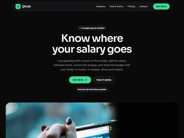

Deep black, dark grey cards and mint green, as if the page were the budget app's own dashboard: big numbers and clear envelopes.
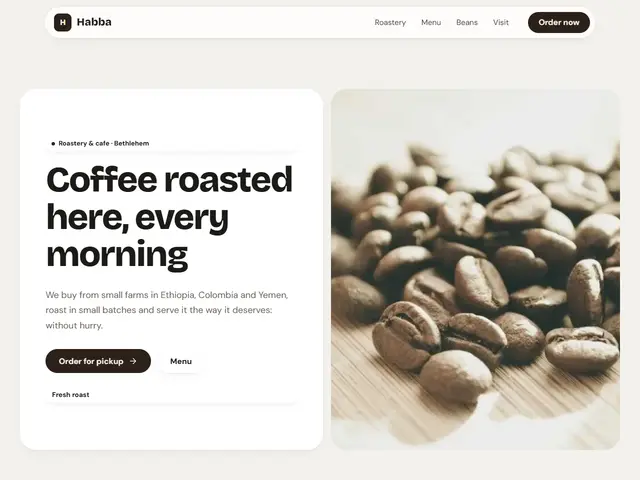

Cream, coffee brown and amber; the beans, the numbers and the address each in its own card.
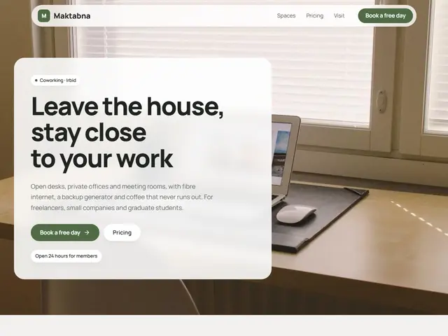

White, olive and stone; desks, offices and meeting rooms in a grid of cards like rooms on a floor plan.
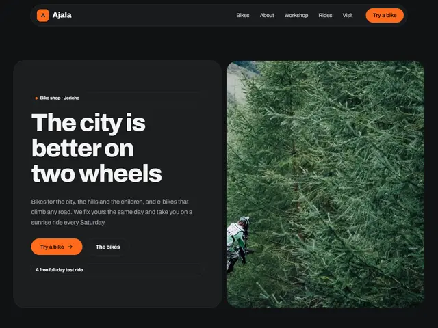

Charcoal and neon orange; bikes, rides and figures in bold cards like the screen of a bike computer.
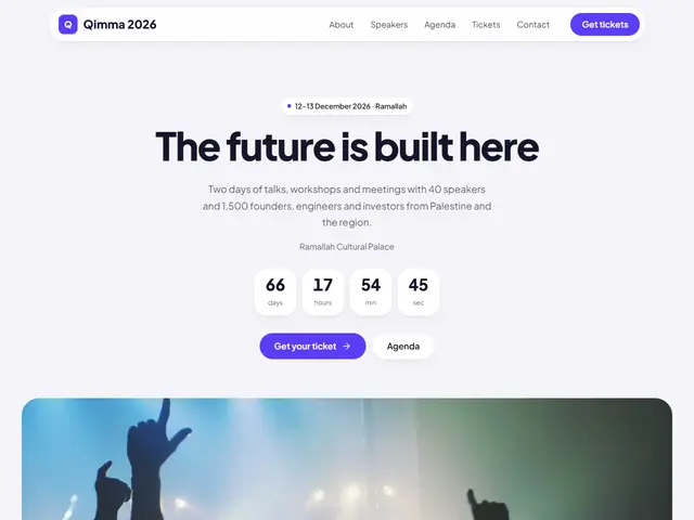

White, violet and lime; speakers, sessions and the countdown in one tidy grid.
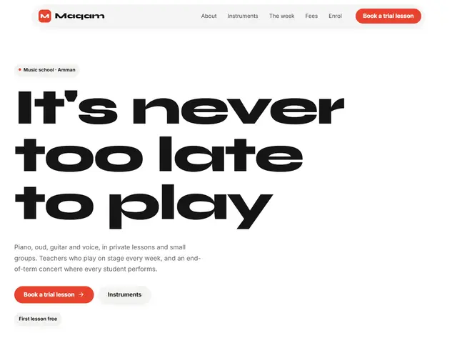

Pure white and tomato red; instruments, lessons and the week in big and small cards, like a setlist taped to the stage.
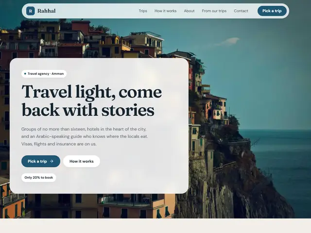

Sand and sea blue; trips, steps and photos in cards like the pages of a well-planned itinerary.
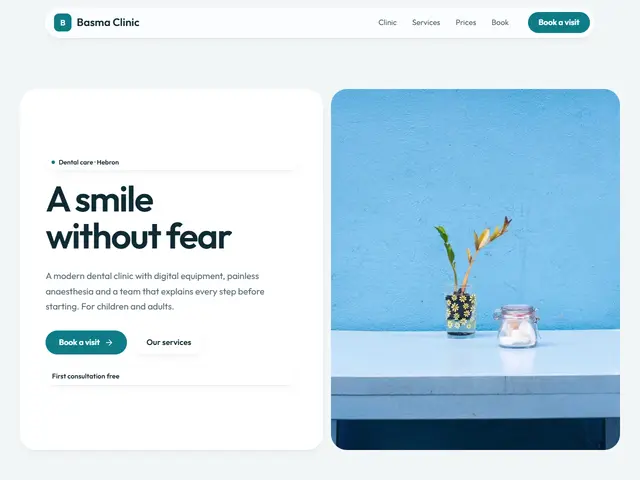

White and a calm teal; services, hours and doctors in clear, easy-to-read cards.
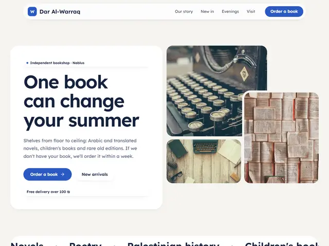

White pages, highlighter yellow and blue, a bookshop sorted like a tidy shelf: the new titles in cards of different sizes and a collage of books up top.
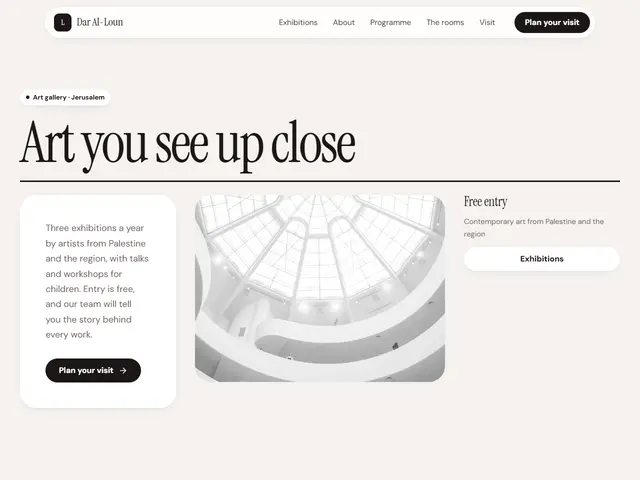

Ivory, dusty pink and black; the exhibitions in cards like a tidy capsule collection, under a magazine-cover headline.
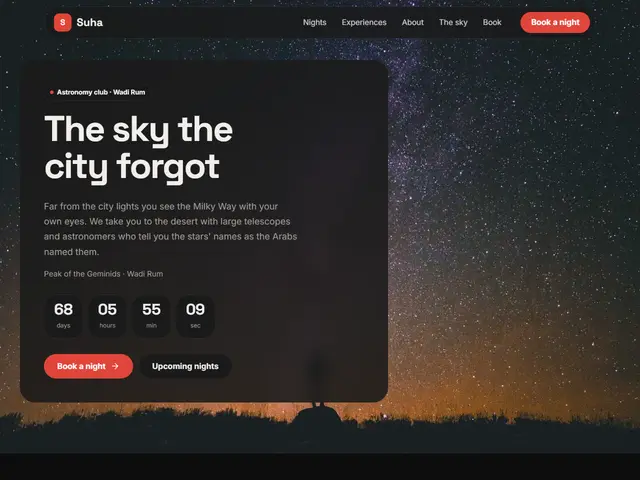

Black and the red of an observer's torch; the sky photos in cards of different sizes like a star chart.