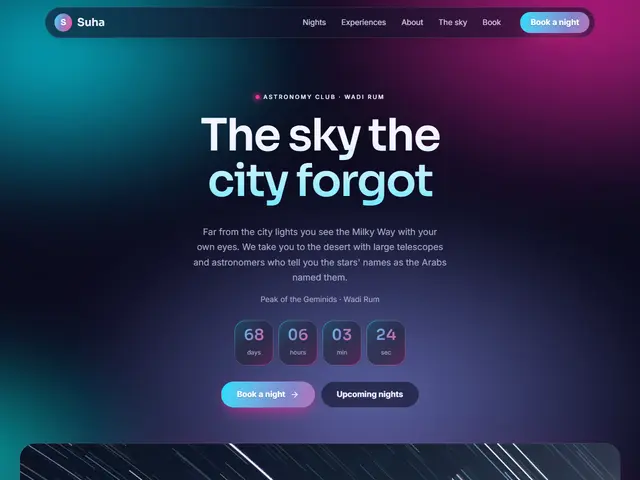

Borealis
Deep navy, teal and pink, an astronomy club under a slowly moving aurora.
Sora · Inter
Colour that drifts like the northern lights
Wide fields of colour that flow and blend slowly behind the page like the northern lights: electric blue, pink, violet and teal over a deep ground. Headings and numbers take the same gradient, and cards get thin coloured edges. For festivals, music, tech and modern brands.
12 designs
12 designs
Deep navy, teal and pink, an astronomy club under a slowly moving aurora.
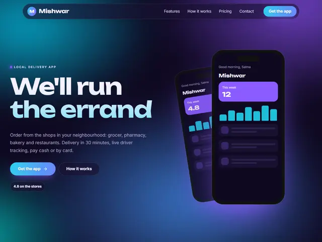

Night violet and electric cyan, a music app with a coloured nebula glowing behind it.


Bluish black, emerald and blue, an AI platform with a gradient that breathes behind the headline.


Pearl white with a pink, orange and violet aurora, a creative agency on a light iridescent ground.
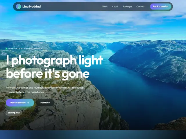

Night-sky black and polar green, a photographer of night landscapes and stars.
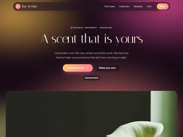

Dark plum, pink and gold, evening perfumes wrapped in a coloured haze.


A dawn sky in peach, lilac and pale blue, a wedding at sunrise.


Black, fire red and orange, a bike shop whose night rides glow under coloured lights.
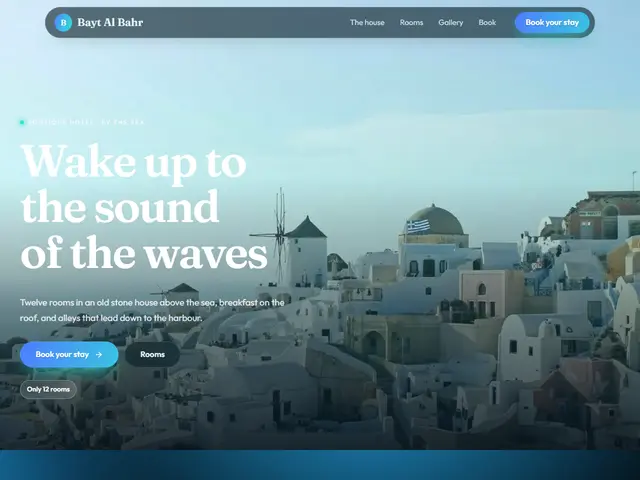

Deep turquoise and night blue, a Red Sea resort under a coloured sky.


White and holographic rainbow, a sneaker shop that shimmers like holographic foil.


Night navy, gold and pink, residential towers glowing under the city sky.


Navy, neon green and pink, a coding academy for young people on a glowing ground.