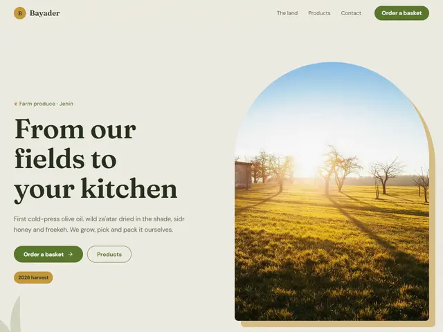
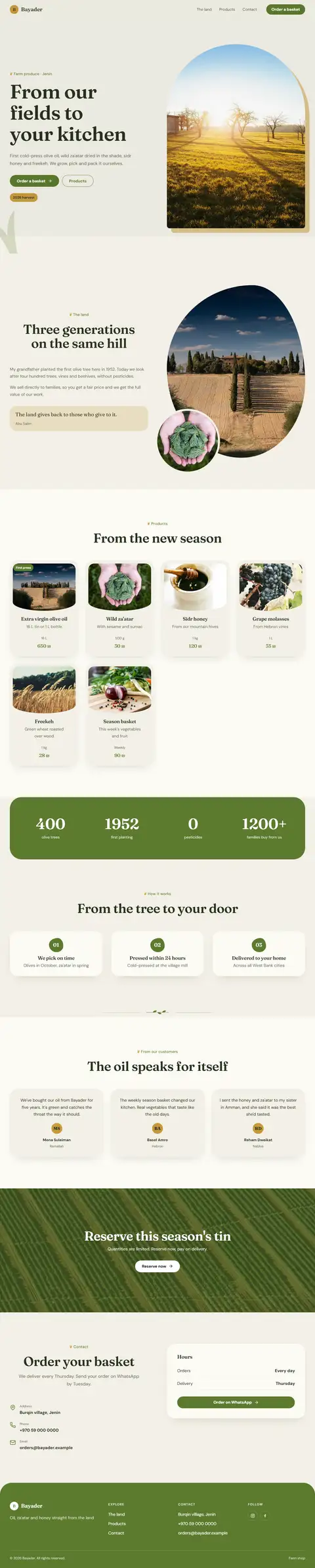
Zaytoun
Olive green, oil gold and drawn leaves, for a farm selling from its own land.
Fraunces · DM Sans
№ 159 · Organic · Demo for Art gallery
Clay and terracotta with soft waves, a gallery of ceramics and earth: warm, slow and close to the hand.
Motion: SubtleCorners: 32pxLight
Describe your project and the prompt updates as you type. What you write stays in your browser.
# Build a website in the "Terra" style

You are building a production-ready website. Follow the design system below exactly and adapt the content to the project. The design comes from the Qalib library (design No. 159).

## 1. The project

- Name: [fill in]
- Type of site: [fill in]
- What it does: [fill in]
- Languages: Arabic and English: Arabic first (RTL) and a full English version (LTR) with a language switch
- Pages: One page with sections and anchor links
- Contact details: [fill in]
- Assets: No photos yet: use suitable placeholders and mark each one TODO for replacement.

## 2. Visual reference

- Live demo (Arabic): https://qalib.omardeek.tech/demos/terra/ar.html
- Live demo (English): https://qalib.omardeek.tech/demos/terra/en.html

Each demo is one HTML file with all its CSS in a <style> tag. Download the raw file (for example `curl -s <url>`), not a summary of it, and treat its CSS as the source of truth for spacing, sizes and effects. The demo's business and text are fictional: never copy them.

## 3. Design DNA: Organic

Close to nature: olive, clay and sand, soft organic shapes, leaves and plants, paper texture and warm serifs. For natural products, wellness and food.

- **Typography:** A soft warm serif for headings, a comfortable humanist face for text, a touch of italic.
- **Colour:** Olive green, clay, sand and cream with one fruit colour (orange or apricot).
- **Layout:** Organic shapes behind photos, wavy dividers, arched or oval photos, relaxed compositions.
- **Shapes:** Large, irregular radii, soft edges, no sharp lines.
- **Imagery:** Plants, hands, natural ingredients, warm sunlight.
- **Motion:** Gentle: slow reveals and a light sway of ornamental leaves.
- **Details:** Line-drawn leaves, a light paper texture, "100% natural" badges.
- **Avoid:** Neon colours, sharp corners, lots of hard black, rigid geometry.

**This design in particular:** Clay and terracotta with soft waves, a gallery of ceramics and earth: warm, slow and close to the hand.

## 4. Design tokens

```css
:root {
  --bg: #F4EBE1; /* page background */
  --surface: #FFF8F0; /* cards, panels, alternate sections */
  --ink: #3B2418; /* main text */
  --muted: #7D5F4E; /* secondary text */
  --accent: #A84E28; /* buttons, links, highlights */
  --accent2: #8C9A6B; /* second highlight */
  --line: #E6D5C3; /* rules and borders */
  --on-accent: #FFFFFF; /* text on the accent colour */
  --radius: 32px;
}
```

- Colour scheme: light
- Fonts (available on Google Fonts and fontsource; self-host them):
  - Arabic headings: Aref Ruqaa (400, 700)
  - Arabic text: Harmattan (400, 700)
  - Latin headings: DM Serif Display (400)
  - Latin text: Work Sans (400, 600, 800)
- Type scale: h1: clamp(2.7rem, 6.2vw, 5.4rem) · h2: clamp(2rem, 4.2vw, 3.3rem) · h3: 1.25rem · text: 17px with 1.7 line height (Arabic 18px and 1.9) · max width 1200px · section spacing clamp(72px, 10vw, 136px)

## 5. Page structure

The demo shows a Art gallery. Build the sections with these visual treatments, in this order:

1. **Header**: A sticky bar: logo at the start, then the links, and a call-to-action button at the end; it collapses into a menu button on phones.
2. **Hero**: Text on one side; a tall photo cut into an arch on the other.
3. **Main offering** «Exhibitions»: a grid of cards (photo or icon, title, short text, price or note)
4. **About** «About the house»: Two columns: heading, paragraphs and a short signed quote; a tall photo with a smaller photo overlapping its corner.
5. **Schedule** «Programme»: a vertical timeline: times on one side, a line with dots
6. **Gallery** «The rooms»: a masonry wall of photos with mixed heights
7. **Call to action** «Become a friend of the house»: a band with a background photo under a dark overlay, white text and a button
8. **Contact** «Your visit»: Two columns: heading, text and address/phone/email with icons; a panel with opening hours and a WhatsApp button.
9. **Footer**: four columns (brand and tagline, page links, contact, social) and a bottom bar

## 6. Motion

Subtle: elements fade up about 24px as they enter, staggered by 70ms; light lifts on hover.

**Decorations in this design:**
- a fine film-grain texture over the whole page (an SVG noise overlay at about 8% opacity)
- small ornamental dividers between sections: a full-width wavy line

## 7. Technical requirements

- **Stack:** Choose the stack that fits the project; prefer static HTML, CSS and JavaScript unless it needs more.
- Semantic HTML, mobile first, adapting at 360, 768, 1024 and 1440px, with no horizontal scrolling.
- Arabic: <html lang="ar" dir="rtl">, CSS logical properties (margin-inline-start, inset-inline-end…), mirrored directional icons, never letter-space or uppercase Arabic, and Arabic text at 18px or more.
- Accessibility: WCAG AA contrast, visible focus states, alt text on images, and all motion off under prefers-reduced-motion.
- Performance: self-hosted fonts with font-display: swap and only the weights and subsets in use, WebP or AVIF images with set dimensions, lazy loading below the first screen, and no heavy libraries for simple effects.
- SEO: a title and description for every page, Open Graph, a favicon, and LocalBusiness structured data where relevant.
- Buttons: WhatsApp links as https://wa.me/<number>, phone as tel:, email as mailto:.

## 8. Delivery

1. Start with the tokens and base styles, then build the sections from top to bottom.
2. Compare the result with the live demo at phone and desktop widths before you finish.
3. Finish with how to run the site and how to deploy it.
Paste it into Claude Code inside a new project folder.
Olive green, oil gold and drawn leaves, for a farm selling from its own land.
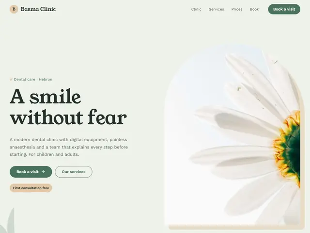

Sage green, warm beige and soft shapes, for a clinic that feels restful.
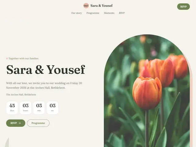

A garden wedding: quiet green, pale pink and arches of branches.
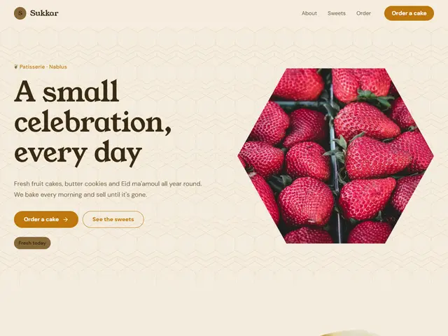
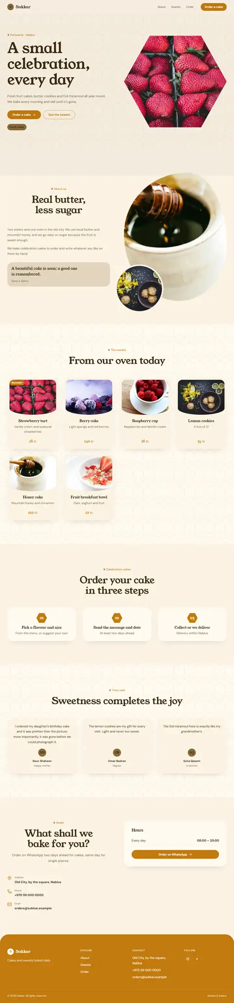
Honey colours and hexagon cells, for a natural bakery.
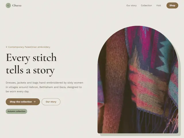
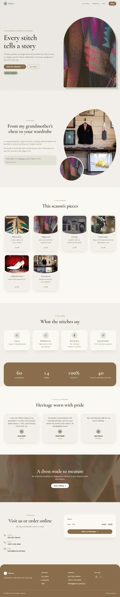
Linen beige, faded green and arched photos, for clothes made of natural fibres.
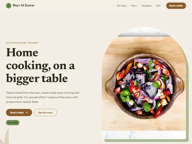

Clay, earth brown and field green, a farm-to-table restaurant: a photo in an arch, a warm menu and light leaves.
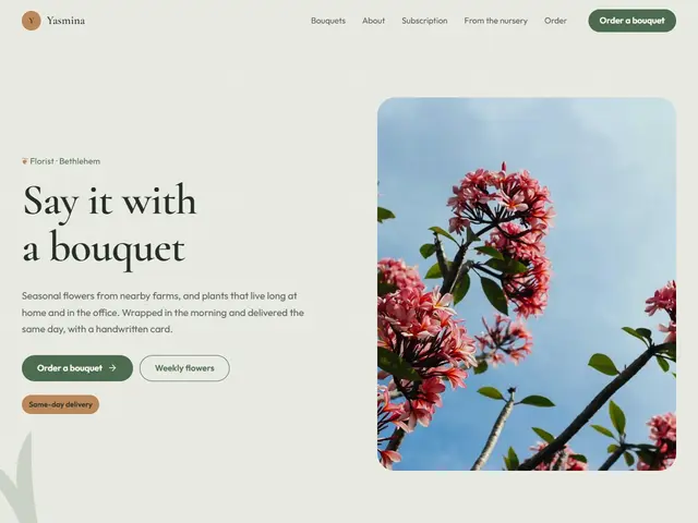

Sage and copper on botanical paper, a florist of field flowers: a photo beside the headline, bouquets in cards and leaves between the sections.
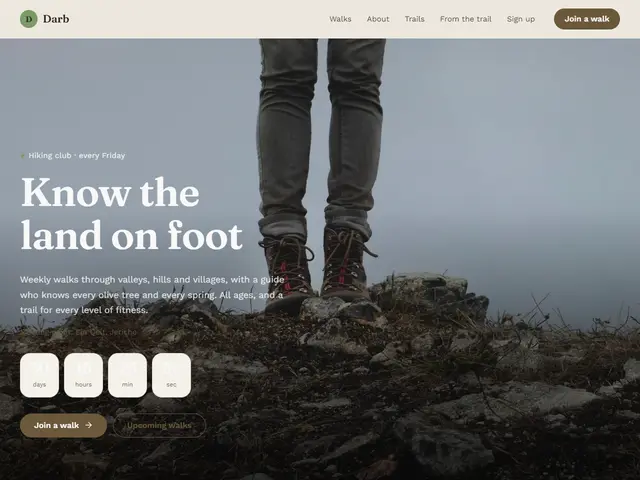

Tree bark, moss green and rough paper, a hiking club among the trees: a full-screen photo, walks in cards and a wall of photos.
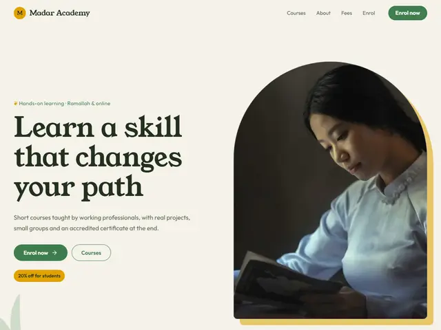

Sprout green and sunshine yellow on pale paper, a school in nature: a photo in an arch, courses in cards and soft waves.
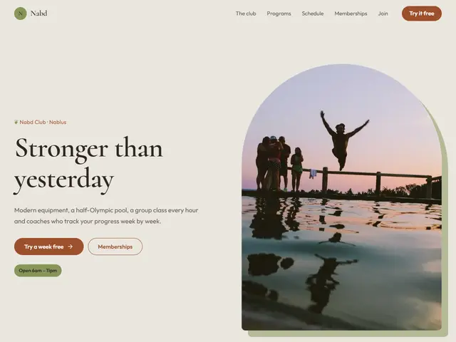

Sand, sienna and olive, a yoga and meditation retreat: a photo in an arch, the day's programme as a timeline and grainy paper.
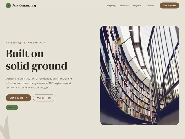

Stone, clay and green, a builder working with local materials: a photo beside the headline, work on a wall and the building stages in steps.