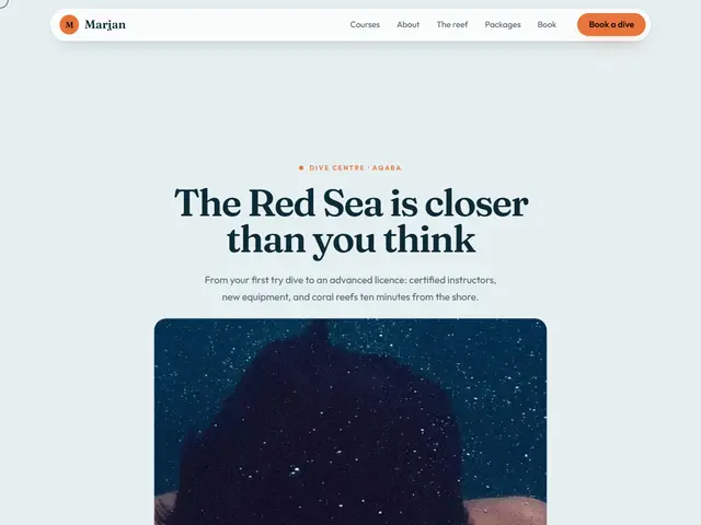

Swell
Sea mist and a sunset orange; the underwater photo grows with the scroll until it fills the screen, then a line about the sea lights up word by word.
Fraunces · Outfit
№ 227 · Interactive · Demo for Restaurant
Two wine-red doors carrying the restaurant's name open onto the table as you scroll, and photos of the dishes pass on a rail.
Motion: RichCorners: 22pxDark
Describe your project and the prompt updates as you type. What you write stays in your browser.
# Build a website in the "Doors" style

You are building a production-ready website. Follow the design system below exactly and adapt the content to the project. The design comes from the Qalib library (design No. 227).

## 1. The project

- Name: [fill in]
- Type of site: [fill in]
- What it does: [fill in]
- Languages: Arabic and English: Arabic first (RTL) and a full English version (LTR) with a language switch
- Pages: One page with sections and anchor links
- Contact details: [fill in]
- Assets: No photos yet: use suitable placeholders and mark each one TODO for replacement.

## 2. Visual reference

- Live demo (Arabic): https://qalib.omardeek.tech/demos/doors/ar.html
- Live demo (English): https://qalib.omardeek.tech/demos/doors/en.html

Each demo is one HTML file with all its CSS in a <style> tag. Download the raw file (for example `curl -s <url>`), not a summary of it, and treat its CSS as the source of truth for spacing, sizes and effects. The demo's business and text are fictional: never copy them.

## 3. Design DNA: Interactive

Sites that move with their visitor: a photo that grows to fill the screen as you scroll, layers that follow the mouse, a light that reveals what lies underneath, a curtain that opens, sections read word by word. Every interaction has a still version that shows all the content to people who prefer less motion.

- **Typography:** Huge headlines in a strong display face (up to 7rem) on short lines, body text in a clear sans; the big words are part of the interaction.
- **Colour:** One strong background (very dark or very light) and a single vivid accent; the photos carry the rest of the colour.
- **Layout:** A full-screen hero that holds in place (sticky) while the scroll drives it, then regular sections broken by other pinned moments (a statement that lights up, a sideways rail of cards).
- **Shapes:** Pill buttons, large rounded photos that become full-bleed, floating cards with soft shadows.
- **Imagery:** Big, high-quality photos that work full screen, plus several smaller ones for layers and trails.
- **Motion:** Linked to the scroll and the pointer, not to time: a progress value from 0 to 1 drives the transforms, pointer movement is eased, buttons are magnetic; all of it stops with prefers-reduced-motion.
- **Details:** A progress bar along the top, a "scroll down" hint that fades once you start, a ring cursor that grows over links, counting numbers.
- **Avoid:** Scroll-jacking (never change or block the wheel), content that stays hidden without JavaScript, effects that get in the way of reading, heavy libraries for what CSS variables and requestAnimationFrame can do.

**This design in particular:** Two wine-red doors carrying the restaurant's name open onto the table as you scroll, and photos of the dishes pass on a rail.

## 4. Design tokens

```css
:root {
  --bg: #120D0B; /* page background */
  --surface: #1C1512; /* cards, panels, alternate sections */
  --ink: #F6EBDD; /* main text */
  --muted: #B9A591; /* secondary text */
  --accent: #E3A72F; /* buttons, links, highlights */
  --accent2: #7A1F2B; /* second highlight */
  --line: #2E231E; /* rules and borders */
  --on-accent: #1B1206; /* text on the accent colour */
  --radius: 22px;
}
```

- Colour scheme: dark
- Fonts (available on Google Fonts and fontsource; self-host them):
  - Arabic headings: Rakkas (400)
  - Arabic text: Tajawal (400, 500, 800)
  - Latin headings: DM Serif Display (400)
  - Latin text: DM Sans (400, 500, 700)
- Type scale: h1: clamp(2.7rem, 6.2vw, 5.4rem) · h2: clamp(2rem, 4.2vw, 3.3rem) · h3: 1.25rem · text: 17px with 1.7 line height (Arabic 18px and 1.9) · max width 1200px · section spacing clamp(72px, 10vw, 136px)

## 5. Page structure

The demo shows a Restaurant. Build the sections with these visual treatments, in this order:

1. **Header**: Just the name and a few small text links; no button.
2. **Hero**: A pinned hero: two accent-coloured panels bearing the brand name cover the screen and open like doors with the scroll onto a full photo with the headline and buttons.
3. **Running text band**: a band of short words running continuously sideways
4. **About** «Our story»: Two columns: heading, paragraphs and a short signed quote; a tall photo with a smaller photo overlapping its corner.
5. **Main offering** «The menu»: a menu in groups, each item with a dotted leader running to its price
6. **Figures**: four very large numbers that count up as they scroll into view
7. **Gallery** «The place»: a row of tall photo cards that slides sideways as you scroll down while the section holds still
8. **Testimonials** «Kind words»: a row of testimonial cards drifting sideways, pausing on hover
9. **Call to action** «Planning a gathering?»: a huge centred line of text with a button under it
10. **Contact** «Visit us»: A large card on a tinted background: contact details on one side, the hours and button on the other.
11. **Footer**: the business name set huge across the footer, above the columns

## 6. Motion

Rich: the headline rises word by word, 90ms staggered reveals, magnetic buttons, parallax photos and counters; all of it off under prefers-reduced-motion.

**Decorations in this design:**
- a thin progress bar along the top edge showing the scroll position
- a custom ring cursor that grows over links (fine pointers only)

**Interactions:** Build them without libraries. Pinned sections are tall, with a stage inside that is `position: sticky; top: 0; height: 100svh`. One requestAnimationFrame-throttled scroll handler writes each section's progress p (0 to 1) to a CSS variable, and CSS turns it into transforms, `clip-path` and opacity with `calc()`. Pointer effects write eased variables (−1 to 1, and pixel positions) in a single animation loop that runs only while the section is on screen; with no pointer for two seconds the values drift slowly on their own, so touch screens see the effect too. Pin only when JavaScript runs and `prefers-reduced-motion` is not set; otherwise every section is a still layout with all of its content visible (the zoom photo framed with its call to action, the curtain open, the statement fully lit, the rail scrollable by hand). Never change the scroll speed or block the wheel.

- Curtain: a tall section (about 240vh) with a sticky stage. Behind, the full-screen photo with the headline, lead and buttons; in front, two panels, each half the width, in the accent colour (one slightly darker), carrying the brand name split across them in huge display type, with a small round knob near the meeting edge. As p goes from 0.06 to 0.66 the panels slide out to their sides (`translateX` up to ±101%), the photo eases from scale 1.16 to 1, and the text rises and fades in. Hide the panels after p = 0.7.
- Rail: a section with a sticky stage holding the heading and a single row of tall photo cards wider than the screen. Make the section as tall as the screen plus the row's overflow (`100vh × 1.15 + overflow`) and translate the row by `p × overflow` toward the start side (rightward in Arabic, leftward in English), with a progress line below. Without motion the row simply scrolls sideways by hand.

## 7. Technical requirements

- **Stack:** Choose the stack that fits the project; prefer static HTML, CSS and JavaScript unless it needs more.
- Semantic HTML, mobile first, adapting at 360, 768, 1024 and 1440px, with no horizontal scrolling.
- Arabic: <html lang="ar" dir="rtl">, CSS logical properties (margin-inline-start, inset-inline-end…), mirrored directional icons, never letter-space or uppercase Arabic, and Arabic text at 18px or more.
- Accessibility: WCAG AA contrast, visible focus states, alt text on images, and all motion off under prefers-reduced-motion.
- Performance: self-hosted fonts with font-display: swap and only the weights and subsets in use, WebP or AVIF images with set dimensions, lazy loading below the first screen, and no heavy libraries for simple effects.
- SEO: a title and description for every page, Open Graph, a favicon, and LocalBusiness structured data where relevant.
- Buttons: WhatsApp links as https://wa.me/<number>, phone as tel:, email as mailto:.

## 8. Delivery

1. Start with the tokens and base styles, then build the sections from top to bottom.
2. Compare the result with the live demo at phone and desktop widths before you finish.
3. Finish with how to run the site and how to deploy it.
Paste it into Claude Code inside a new project folder.
Sea mist and a sunset orange; the underwater photo grows with the scroll until it fills the screen, then a line about the sea lights up word by word.
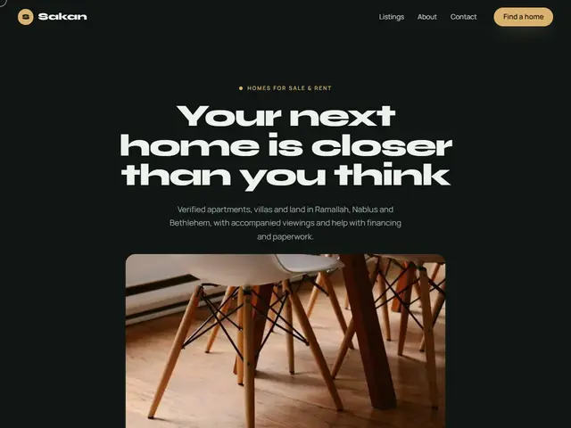

Night-dark green and sand gold; the apartment opens up as you scroll, and the listings pass by on a sideways rail.
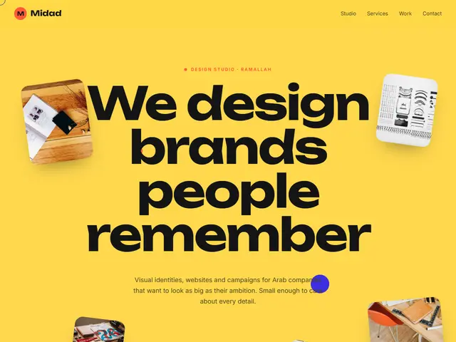

Loud yellow, black and vermilion; work samples float at different depths and chase the mouse, and projects slide past sideways.
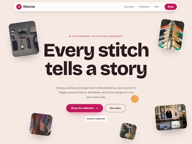

Soft blush and raspberry; pieces from the shop are scattered around the headline like cut-outs that sway with the mouse.
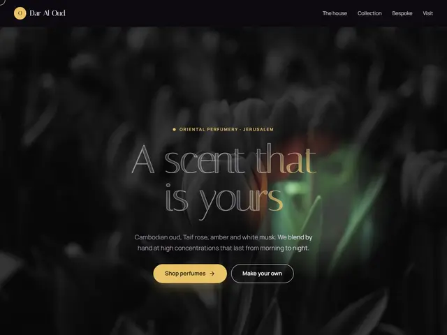

A dark hero where the pointer carries a light that reveals the colour and the golden headline; the perfumes pass on a rail as you scroll.
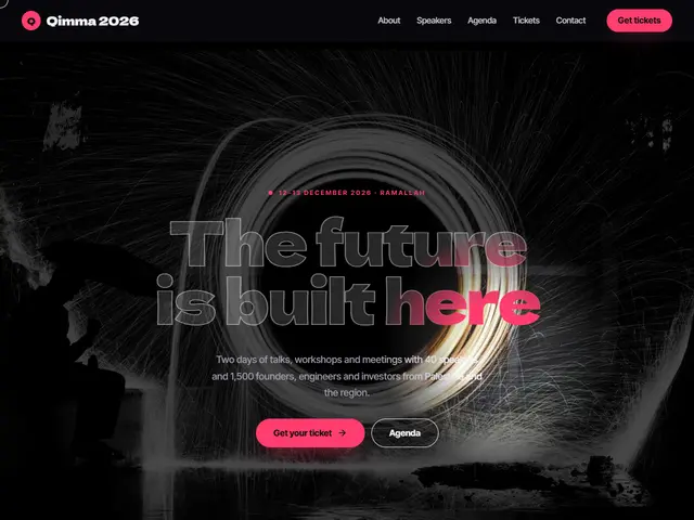

Stage black and hot pink; a spotlight follows the pointer over the hall, and the speakers pass sideways before the programme.
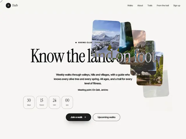

Paper white and black ink; move the mouse and trail photos drop behind it and fade like footprints, the name inverting over them.
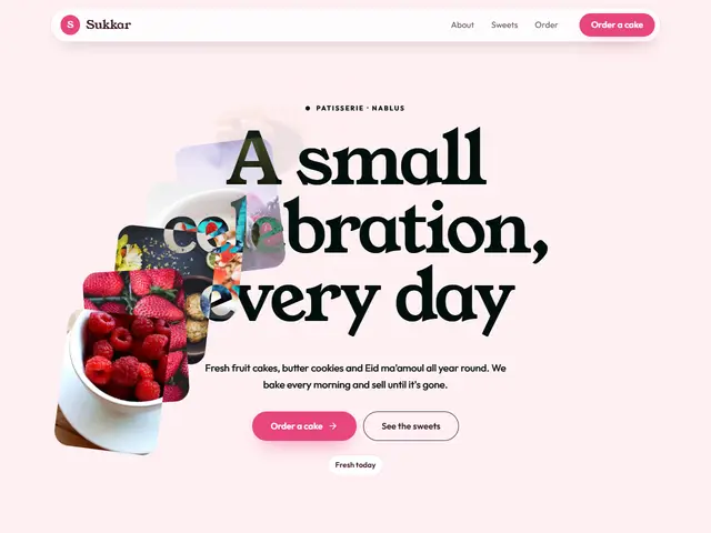

Sugar pink and caramel yellow; the sweets follow the mouse and fall like sprinkles, and the menu is a set of cheerful cards.
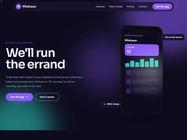

Night violet and turquoise; the phone leans toward the pointer with a moving shine, small cards floating around it.
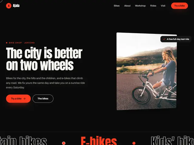

Black, fiery red and tall condensed type; the rider's photo tilts with the pointer, and the shop's motto lights up as you go down.
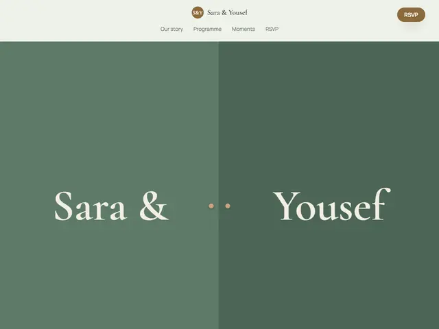

Sage green and antique gold; a curtain bearing both names opens onto the wedding photo, then a vow is read word by word.