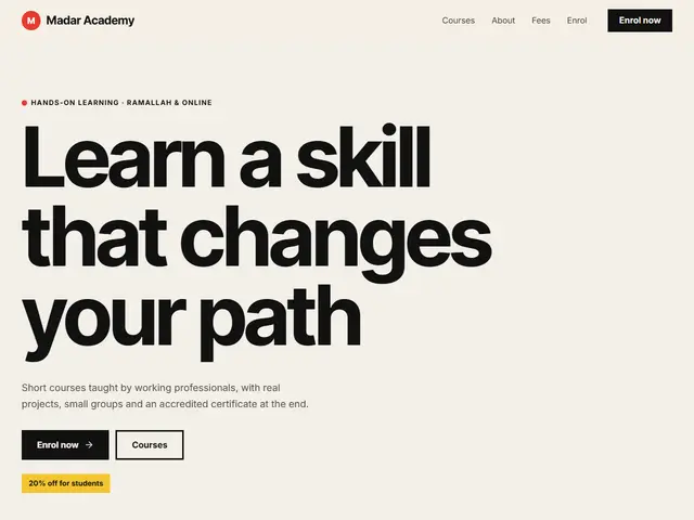

Bauhaus
Red, yellow, blue and black with circles, squares and triangles, like a Bauhaus school poster.
Inter Tight · Inter
№ 194 · Geometric · Demo for Art gallery
Red and black on white, a strict grid and one alignment, a gallery that hangs its exhibitions like International Style posters.
Motion: SubtleCorners: 0pxLight
Describe your project and the prompt updates as you type. What you write stays in your browser.
# Build a website in the "Swiss" style

You are building a production-ready website. Follow the design system below exactly and adapt the content to the project. The design comes from the Qalib library (design No. 194).

## 1. The project

- Name: [fill in]
- Type of site: [fill in]
- What it does: [fill in]
- Languages: Arabic and English: Arabic first (RTL) and a full English version (LTR) with a language switch
- Pages: One page with sections and anchor links
- Contact details: [fill in]
- Assets: No photos yet: use suitable placeholders and mark each one TODO for replacement.

## 2. Visual reference

- Live demo (Arabic): https://qalib.omardeek.tech/demos/swiss/ar.html
- Live demo (English): https://qalib.omardeek.tech/demos/swiss/en.html

Each demo is one HTML file with all its CSS in a <style> tag. Download the raw file (for example `curl -s <url>`), not a summary of it, and treat its CSS as the source of truth for spacing, sizes and effects. The demo's business and text are fictional: never copy them.

## 3. Design DNA: Geometric

A strict, beautiful system: the Swiss grid, circles, squares and triangles, primary colours (red, yellow, blue, black) and strong sans type on one alignment.

- **Typography:** A strong grotesque in heavy weights, always aligned to the start edge, huge numerals.
- **Colour:** White or paper background, black, and pure primaries in large areas.
- **Layout:** A strict visible grid, rectangular colour blocks, balanced asymmetry, geometric shapes as main elements.
- **Shapes:** Full circles, squares, half-circles and triangles; no rounded card corners.
- **Imagery:** Photos cropped into circles and squares, or duotoned with the primaries.
- **Motion:** Shapes slide and rotate into place, without bounce.
- **Details:** Huge section numbers, short thick bars, vertical side text.
- **Avoid:** Ornament, gradients, shadows, decorative serifs.

**This design in particular:** Red and black on white, a strict grid and one alignment, a gallery that hangs its exhibitions like International Style posters.

## 4. Design tokens

```css
:root {
  --bg: #FFFFFF; /* page background */
  --surface: #F2F2F2; /* cards, panels, alternate sections */
  --ink: #000000; /* main text */
  --muted: #555555; /* secondary text */
  --accent: #FF0000; /* buttons, links, highlights */
  --accent2: #000000; /* second highlight */
  --line: #000000; /* rules and borders */
  --on-accent: #FFFFFF; /* text on the accent colour */
  --radius: 0px;
}
```

- Colour scheme: light
- Fonts (available on Google Fonts and fontsource; self-host them):
  - Arabic headings: Alexandria (300, 500, 800)
  - Arabic text: Noto Sans Arabic (400, 600, 800)
  - Latin headings: Work Sans (400, 600, 800)
  - Latin text: Work Sans (400, 600, 800)
- Type scale: h1: clamp(2.7rem, 6.2vw, 5.4rem) · h2: clamp(2rem, 4.2vw, 3.3rem) · h3: 1.25rem · text: 17px with 1.7 line height (Arabic 18px and 1.9) · max width 1200px · section spacing clamp(72px, 10vw, 136px)

## 5. Page structure

The demo shows a Art gallery. Build the sections with these visual treatments, in this order:

1. **Header**: A sticky bar: logo at the start, then the links, and a call-to-action button at the end; it collapses into a menu button on phones.
2. **Hero**: Typography first: a giant headline across the page, a short lead and buttons, then a wide photo below.
3. **Main offering** «Exhibitions»: a numbered list of rows: title and text, with the price at the end
4. **About** «About the house»: The heading on one side, the paragraphs in two text columns on the other, then a wide photo.
5. **Schedule** «Programme»: a ruled table: number, title, description, and price or time
6. **Gallery** «The rooms»: a photo grid with one large tile and captions on the photos
7. **Call to action** «Become a friend of the house»: a full-width coloured band with a heading, a line of text and a button
8. **Contact** «Your visit»: Two columns: heading, text and address/phone/email with icons; a panel with opening hours and a WhatsApp button.
9. **Footer**: four columns (brand and tagline, page links, contact, social) and a bottom bar

## 6. Motion

Subtle: elements fade up about 24px as they enter, staggered by 70ms; light lifts on hover.

**Decorations in this design:**
- a faint measurement grid in the background

## 7. Technical requirements

- **Stack:** Choose the stack that fits the project; prefer static HTML, CSS and JavaScript unless it needs more.
- Semantic HTML, mobile first, adapting at 360, 768, 1024 and 1440px, with no horizontal scrolling.
- Arabic: <html lang="ar" dir="rtl">, CSS logical properties (margin-inline-start, inset-inline-end…), mirrored directional icons, never letter-space or uppercase Arabic, and Arabic text at 18px or more.
- Accessibility: WCAG AA contrast, visible focus states, alt text on images, and all motion off under prefers-reduced-motion.
- Performance: self-hosted fonts with font-display: swap and only the weights and subsets in use, WebP or AVIF images with set dimensions, lazy loading below the first screen, and no heavy libraries for simple effects.
- SEO: a title and description for every page, Open Graph, a favicon, and LocalBusiness structured data where relevant.
- Buttons: WhatsApp links as https://wa.me/<number>, phone as tel:, email as mailto:.

## 8. Delivery

1. Start with the tokens and base styles, then build the sections from top to bottom.
2. Compare the result with the live demo at phone and desktop widths before you finish.
3. Finish with how to run the site and how to deploy it.
Paste it into Claude Code inside a new project folder.
Red, yellow, blue and black with circles, squares and triangles, like a Bauhaus school poster.
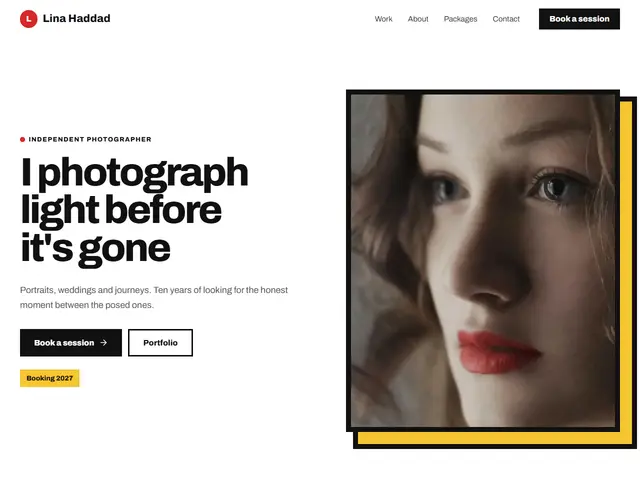

A gallery inside rectangles with thick black lines and colour blocks, a nod to Mondrian.
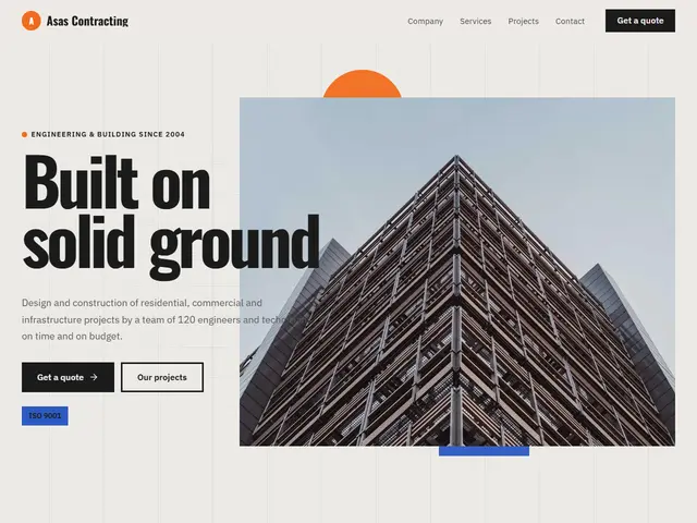

Grey, orange and blue, geometric building modules and a visible grid for a contractor.
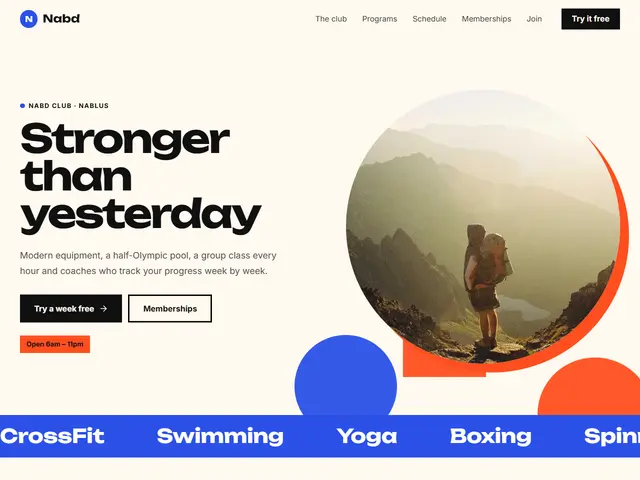

Strong blue, orange and a photo inside a big circle, for a confident gym.
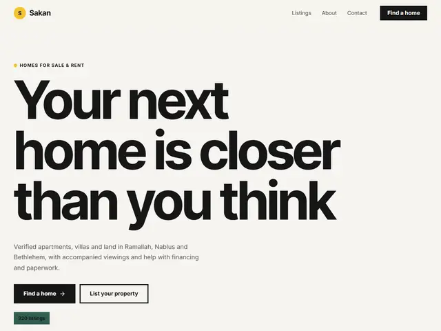

Yellow, dark green and rectangular colour blocks, for real estate with a modern architectural feel.
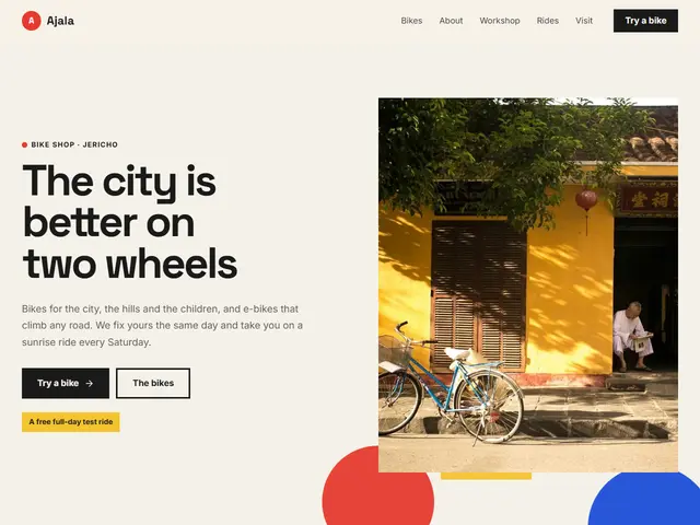

Pale paper, red, blue and yellow, a bike shop on a Bauhaus grid: circles and triangles around the photo, an orderly price list and photos in a grid.
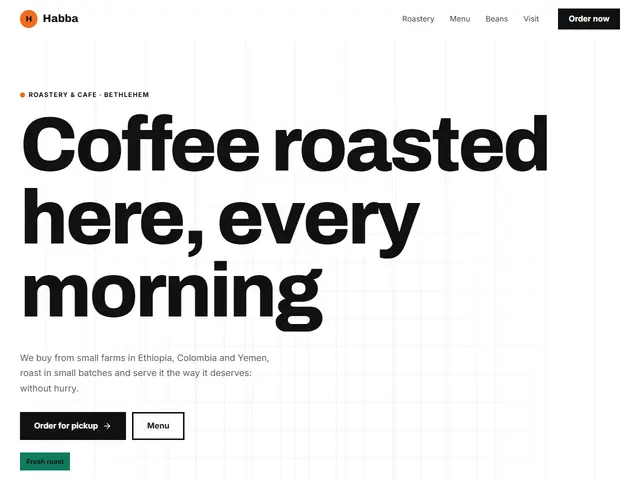

White, black and orange, a café of squares and quarter circles: a huge full-width headline, a clear menu and photos in a bento grid.
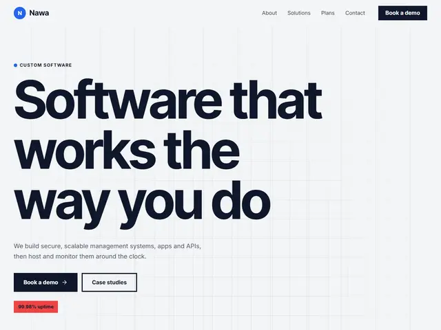

Light grey, blue, yellow and red, a software company in the language of technical drawing: a fine grid, basic shapes and orderly plans.
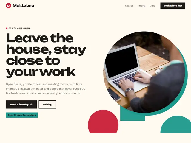

Cream, deep red and teal, a coworking space of cut shapes: photos in circles, a wide headline and the spaces in cards.
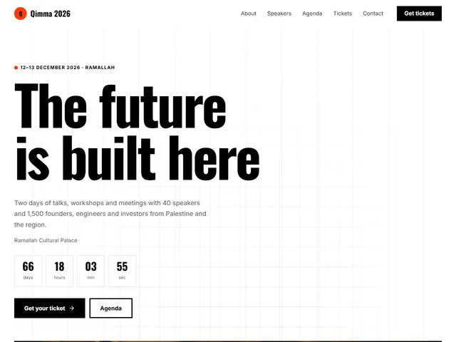

White, black, red-orange and blue, a conference on a Swiss grid: a huge headline, speakers in cards and the programme in a table.
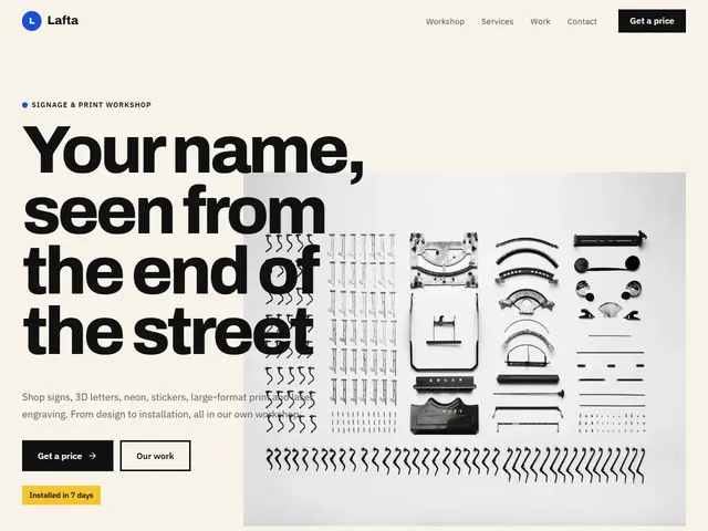

Blue, red and yellow on pale paper, a sign workshop speaking Mondrian: coloured rectangles, a poster headline and work in a grid.