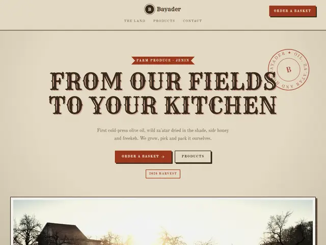

Old Souq
Aged paper, a round stamp and ticket cards, like a stall in an old market.
Rye · Old Standard TT
№ 017 · Vintage · Demo for Travel agency
Postal red, airmail blue and postmarks, a travel agency like a card sent from abroad fifty years ago.
Motion: CalmCorners: 2pxLight
Describe your project and the prompt updates as you type. What you write stays in your browser.
# Build a website in the "Postcard" style

You are building a production-ready website. Follow the design system below exactly and adapt the content to the project. The design comes from the Qalib library (design No. 017).

## 1. The project

- Name: [fill in]
- Type of site: [fill in]
- What it does: [fill in]
- Languages: Arabic and English: Arabic first (RTL) and a full English version (LTR) with a language switch
- Pages: One page with sections and anchor links
- Contact details: [fill in]
- Assets: No photos yet: use suitable placeholders and mark each one TODO for replacement.

## 2. Visual reference

- Live demo (Arabic): https://qalib.omardeek.tech/demos/postcard/ar.html
- Live demo (English): https://qalib.omardeek.tech/demos/postcard/en.html

Each demo is one HTML file with all its CSS in a <style> tag. Download the raw file (for example `curl -s <url>`), not a summary of it, and treat its CSS as the source of truth for spacing, sizes and effects. The demo's business and text are fictional: never copy them.

## 3. Design DNA: Vintage

The spirit of old shops and print houses: aged paper, big display type, round badges, tickets and labels, and sepia photographs.

- **Typography:** A heavy display face with period character for headings, a typewriter face for small details, a classic serif for text.
- **Colour:** Cream or beige paper with grain, dark brown ink, and a printer's red or ink blue as the accent.
- **Layout:** Poster-like centred compositions, headings inside ribbons and badges, sections divided by dashed rules.
- **Shapes:** Ticket cards with notched corners, dashed borders, round badges, photos with white borders like old prints, slightly tilted.
- **Imagery:** Sepia or black-and-white photographs with grain and a vignette.
- **Motion:** Minimal: quiet reveals and one stamp that lands on the page.
- **Details:** Light paper texture, "established" stamps, numbers in circles, ✦ stars between elements.
- **Avoid:** Pure white, glass and modern gradients, geometric modern sans faces.

**This design in particular:** Postal red, airmail blue and postmarks, a travel agency like a card sent from abroad fifty years ago.

## 4. Design tokens

```css
:root {
  --bg: #F3EBDD; /* page background */
  --surface: #FFF9EE; /* cards, panels, alternate sections */
  --ink: #263544; /* main text */
  --muted: #5E6B76; /* secondary text */
  --accent: #C8553D; /* buttons, links, highlights */
  --accent2: #3A7CA5; /* second highlight */
  --line: #D8CCB6; /* rules and borders */
  --on-accent: #FFF9EE; /* text on the accent colour */
  --radius: 2px;
}
```

- Colour scheme: light
- Fonts (available on Google Fonts and fontsource; self-host them):
  - Arabic headings: Lalezar (400)
  - Arabic text: Noto Naskh Arabic (400, 600, 700)
  - Latin headings: Abril Fatface (400)
  - Latin text: Lora (400, 600)
  - Accent (labels and numbers): Special Elite (400)
- Type scale: h1: clamp(2.7rem, 6.2vw, 5.4rem) · h2: clamp(2rem, 4.2vw, 3.3rem) · h3: 1.25rem · text: 17px with 1.7 line height (Arabic 18px and 1.9) · max width 1200px · section spacing clamp(72px, 10vw, 136px)

## 5. Page structure

The demo shows a Travel agency. Build the sections with these visual treatments, in this order:

1. **Header**: A sticky bar: logo at the start, then the links, and a call-to-action button at the end; it collapses into a menu button on phones.
2. **Hero**: Text on one side; a collage of three overlapping photos on the other.
3. **Main offering** «Trips»: a numbered list of rows: title and text, with the price at the end
4. **Process** «How it works»: numbered steps in a row with big numbers
5. **About** «About Rahhal»: Two columns: heading, paragraphs and a short signed quote; a tall photo with a smaller photo overlapping its corner.
6. **Gallery** «From our trips»: a photo grid with one large tile and captions on the photos
7. **Testimonials** «Travellers»: three testimonial cards with initials avatars
8. **FAQ** «Questions»: an accordion of questions with the first one open
9. **Call to action** «The spring trip fills up first»: a full-width coloured band with a heading, a line of text and a button
10. **Contact** «Contact»: A large card on a tinted background: contact details on one side, the hours and button on the other.
11. **Footer**: a single row: logo and tagline, social icons, copyright

## 6. Motion

Calm: only soft fades (about 1s) as sections enter; no movement on hover beyond colour.

**Decorations in this design:**
- a fine film-grain texture over the whole page (an SVG noise overlay at about 8% opacity)
- a round rubber stamp with the business name on a circular path
- red-and-blue airmail stripes along the header and footer

## 7. Technical requirements

- **Stack:** Choose the stack that fits the project; prefer static HTML, CSS and JavaScript unless it needs more.
- Semantic HTML, mobile first, adapting at 360, 768, 1024 and 1440px, with no horizontal scrolling.
- Arabic: <html lang="ar" dir="rtl">, CSS logical properties (margin-inline-start, inset-inline-end…), mirrored directional icons, never letter-space or uppercase Arabic, and Arabic text at 18px or more.
- Accessibility: WCAG AA contrast, visible focus states, alt text on images, and all motion off under prefers-reduced-motion.
- Performance: self-hosted fonts with font-display: swap and only the weights and subsets in use, WebP or AVIF images with set dimensions, lazy loading below the first screen, and no heavy libraries for simple effects.
- SEO: a title and description for every page, Open Graph, a favicon, and LocalBusiness structured data where relevant.
- Buttons: WhatsApp links as https://wa.me/<number>, phone as tel:, email as mailto:.

## 8. Delivery

1. Start with the tokens and base styles, then build the sections from top to bottom.
2. Compare the result with the live demo at phone and desktop widths before you finish.
3. Finish with how to run the site and how to deploy it.
Paste it into Claude Code inside a new project folder.
Aged paper, a round stamp and ticket cards, like a stall in an old market.
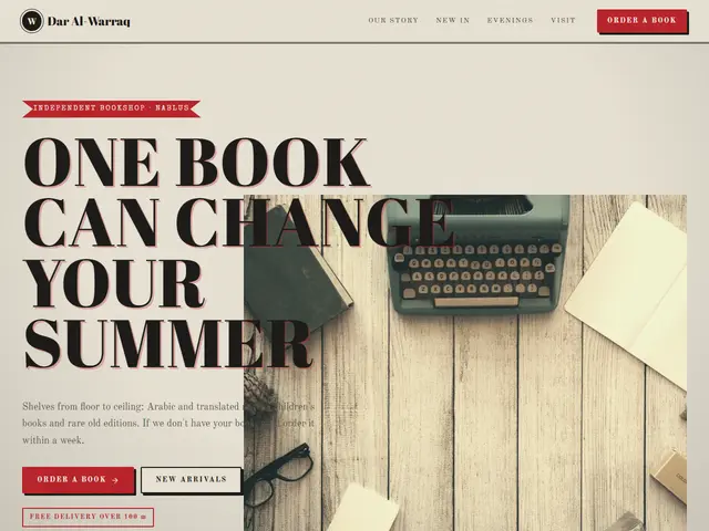

Printer's red, ink blue and a typewriter, a bookshop with its own letterpress: a poster headline, the titles in a list and the evenings in columns.
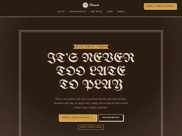

Roasted brown, mustard and blackletter, a music school like a 1940s concert-hall sign: a framed headline, lessons in a dotted list and one quote at a time.
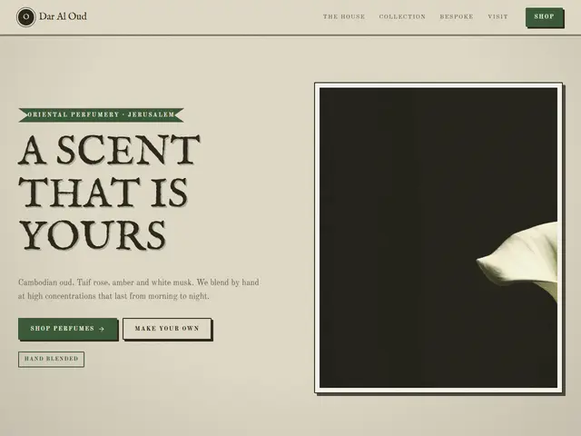

Old apothecary green and bottle labels, like a perfumer's shelves in a Jerusalem souq.
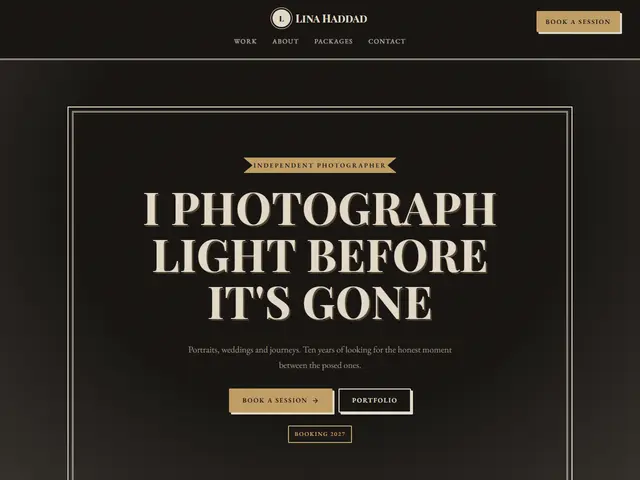

Dark sepia, film grain and a frame, like a print show in a developing room.
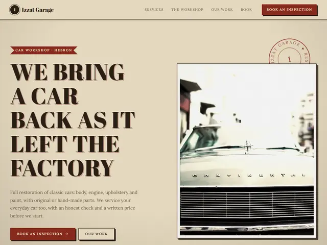

Aged paper, oxblood and faded teal, like the hand-painted sign of a family garage: a round stamp, a dotted price list and photos of old cars.
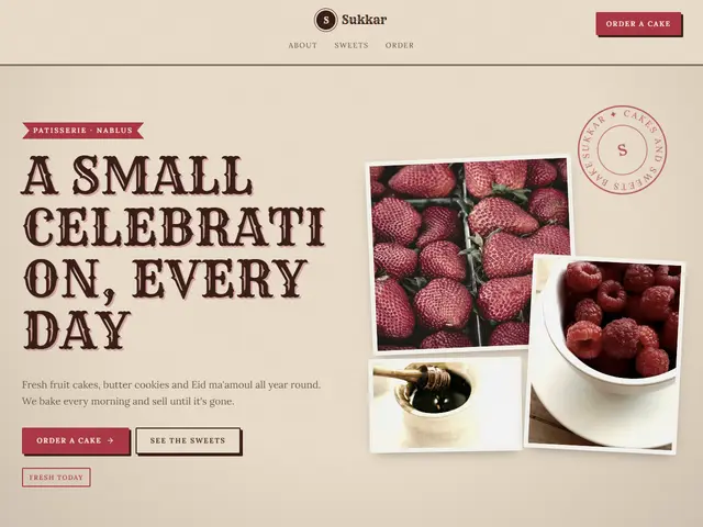
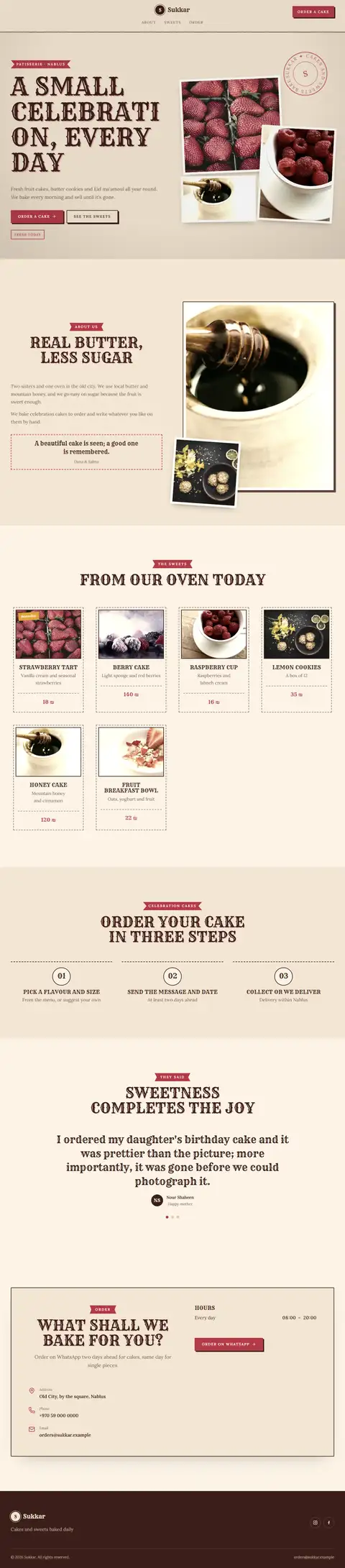
Candy red and caramel on old paper, like a fifties sweet-shop window: stacked photos, stamped cards and one customer's word at a time.
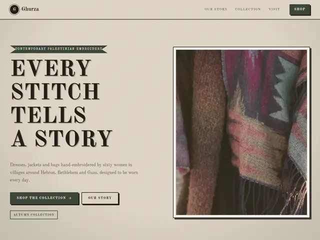
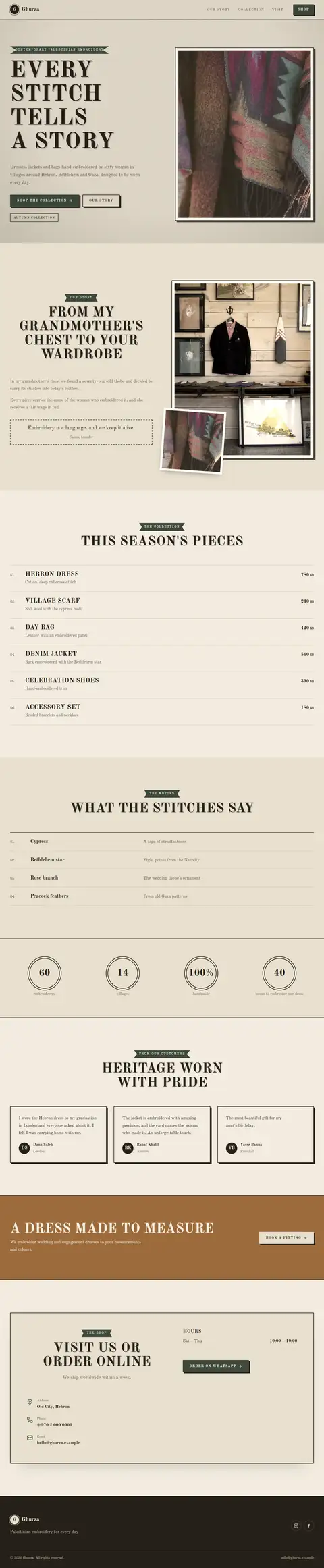
Dark olive, copper and typewriter labels, like the order book of a neighbourhood tailor: numbered lists and a ruled table of fittings.
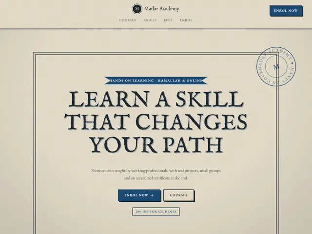

Blue ink and correcting red on yellowed school paper, like an old exercise book: a framed headline, text in columns and numbered steps.
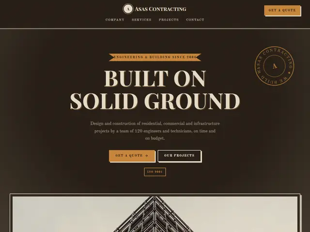

Dark wood, honey and moss green, like an old joinery workshop: big printed capitals, work photos in a grid and the steps of the job as a list.
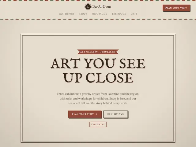

Rust and olive on warm paper, like an opening invitation sent by post: a striped envelope edge, the month's programme on a timeline and a wall of photos.