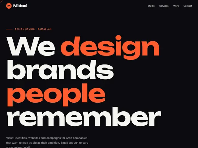

Kinetic
Black and fiery orange, a headline that rises word by word, a tilted text band and a cursor that follows you.
Unbounded · Inter
№ 045 · Animated · Demo for Signage & print
Blue night, neon pink and turquoise, like a lit sign shop at night: huge type, work on a wall and steps that appear one after another.
Motion: RichCorners: 16pxDark
Describe your project and the prompt updates as you type. What you write stays in your browser.
# Build a website in the "Glare" style

You are building a production-ready website. Follow the design system below exactly and adapt the content to the project. The design comes from the Qalib library (design No. 045).

## 1. The project

- Name: [fill in]
- Type of site: [fill in]
- What it does: [fill in]
- Languages: Arabic and English: Arabic first (RTL) and a full English version (LTR) with a language switch
- Pages: One page with sections and anchor links
- Contact details: [fill in]
- Assets: No photos yet: use suitable placeholders and mark each one TODO for replacement.

## 2. Visual reference

- Live demo (Arabic): https://qalib.omardeek.tech/demos/glare/ar.html
- Live demo (English): https://qalib.omardeek.tech/demos/glare/en.html

Each demo is one HTML file with all its CSS in a <style> tag. Download the raw file (for example `curl -s <url>`), not a summary of it, and treat its CSS as the source of truth for spacing, sizes and effects. The demo's business and text are fictional: never copy them.

## 3. Design DNA: Animated

Pages that move with the scroll: headings that rise word by word, running text bands, layered images, numbers that count up. Motion is part of the identity, not decoration.

- **Typography:** A huge display face for the main heading (up to 10vw), split into words that appear in sequence, and a sans for text.
- **Colour:** Strong contrast: very dark or very light background with one fiery accent, and animated gradients where useful.
- **Layout:** Full-width sections, moving text bands between sections, horizontal image strips, giant numbers.
- **Shapes:** Medium radii, magnetic buttons that follow the pointer, rotating circular text.
- **Imagery:** Large photos with parallax depth and slow zoom, or morphing gradient blobs.
- **Motion:** Rich but deliberate: 60–90ms staggers, strong ease-out curves, and everything stops under prefers-reduced-motion.
- **Details:** Counters, a scroll progress bar, a custom cursor, text that fills with colour on hover.
- **Avoid:** Motion without purpose, constant movement that hurts reading, ignoring reduced-motion preferences.

**This design in particular:** Blue night, neon pink and turquoise, like a lit sign shop at night: huge type, work on a wall and steps that appear one after another.

## 4. Design tokens

```css
:root {
  --bg: #0B0F14; /* page background */
  --surface: #131A22; /* cards, panels, alternate sections */
  --ink: #F2F5F8; /* main text */
  --muted: #9AA6B2; /* secondary text */
  --accent: #FF2E63; /* buttons, links, highlights */
  --accent2: #08D9D6; /* second highlight */
  --line: #1F2833; /* rules and borders */
  --on-accent: #FFFFFF; /* text on the accent colour */
  --radius: 16px;
}
```

- Colour scheme: dark
- Fonts (available on Google Fonts and fontsource; self-host them):
  - Arabic headings: Reem Kufi (400, 500, 700)
  - Arabic text: IBM Plex Sans Arabic (400, 600, 700)
  - Latin headings: Space Grotesk (400, 500, 700)
  - Latin text: Inter (400, 500, 700)
- Type scale: h1: clamp(2.7rem, 6.2vw, 5.4rem) · h2: clamp(2rem, 4.2vw, 3.3rem) · h3: 1.25rem · text: 17px with 1.7 line height (Arabic 18px and 1.9) · max width 1200px · section spacing clamp(72px, 10vw, 136px)

## 5. Page structure

The demo shows a Signage & print. Build the sections with these visual treatments, in this order:

1. **Header**: A sticky bar: logo at the start, then the links, and a call-to-action button at the end; it collapses into a menu button on phones.
2. **Hero**: Typography first: a giant headline across the page, a short lead and buttons, then a wide photo below.
3. **Running text band**: a band of short words running continuously sideways
4. **About** «The workshop»: A wide photo with a text card overlapping its lower edge.
5. **Main offering** «Services»: a horizontal strip of tall photos that scrolls sideways
6. **Gallery** «Our work»: a masonry wall of photos with mixed heights
7. **Process** «How it works»: numbered steps in a row with big numbers
8. **Testimonials** «Clients»: a row of testimonial cards drifting sideways, pausing on hover
9. **FAQ** «Questions»: an accordion of questions with the first one open
10. **Contact** «Contact»: A centred heading and text, a large WhatsApp button, contact details in a row and the hours below.
11. **Footer**: the business name set huge across the footer, above the columns

## 6. Motion

Rich: the headline rises word by word, 90ms staggered reveals, magnetic buttons, parallax photos and counters; all of it off under prefers-reduced-motion.

**Decorations in this design:**
- a custom ring cursor that grows over links (fine pointers only)
- a thin progress bar along the top edge showing the scroll position
- a faint measurement grid in the background

## 7. Technical requirements

- **Stack:** Choose the stack that fits the project; prefer static HTML, CSS and JavaScript unless it needs more.
- Semantic HTML, mobile first, adapting at 360, 768, 1024 and 1440px, with no horizontal scrolling.
- Arabic: <html lang="ar" dir="rtl">, CSS logical properties (margin-inline-start, inset-inline-end…), mirrored directional icons, never letter-space or uppercase Arabic, and Arabic text at 18px or more.
- Accessibility: WCAG AA contrast, visible focus states, alt text on images, and all motion off under prefers-reduced-motion.
- Performance: self-hosted fonts with font-display: swap and only the weights and subsets in use, WebP or AVIF images with set dimensions, lazy loading below the first screen, and no heavy libraries for simple effects.
- SEO: a title and description for every page, Open Graph, a favicon, and LocalBusiness structured data where relevant.
- Buttons: WhatsApp links as https://wa.me/<number>, phone as tel:, email as mailto:.

## 8. Delivery

1. Start with the tokens and base styles, then build the sections from top to bottom.
2. Compare the result with the live demo at phone and desktop widths before you finish.
3. Finish with how to run the site and how to deploy it.
Paste it into Claude Code inside a new project folder.
Black and fiery orange, a headline that rises word by word, a tilted text band and a cursor that follows you.
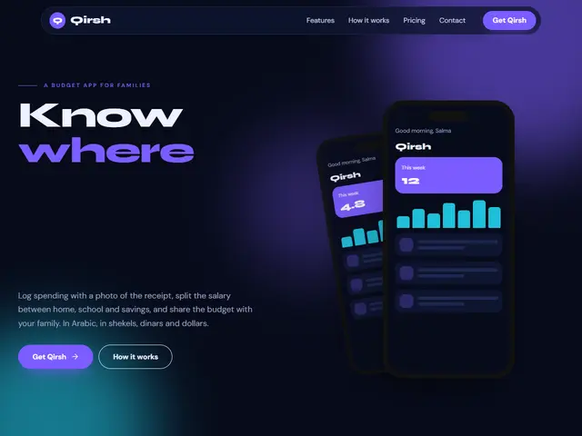

Deep navy under drifting violet and cyan light, a budget app with two floating phones and its features in a bento grid.
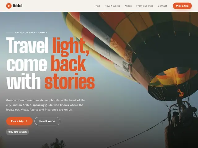

Tall condensed type and layered parallax photos, a travel agency whose cities scroll sideways like a reel.
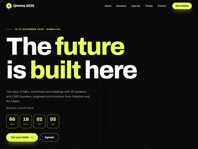

Neon yellow on black with a live day counter, like a screen before launch.
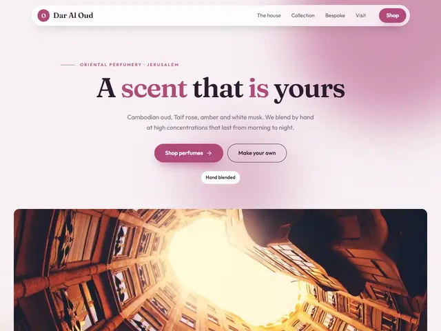

Misty pink and slowly morphing colour, with perfumes that glide sideways.
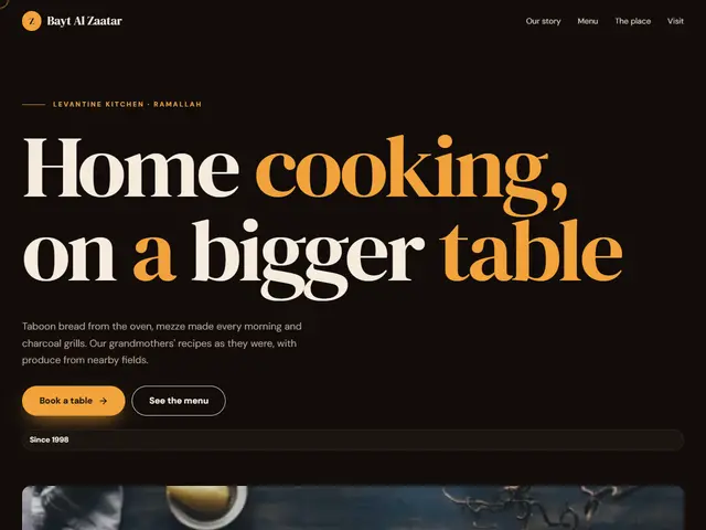

A warm night and saffron yellow, dishes sliding in turn and photos moving as you scroll.
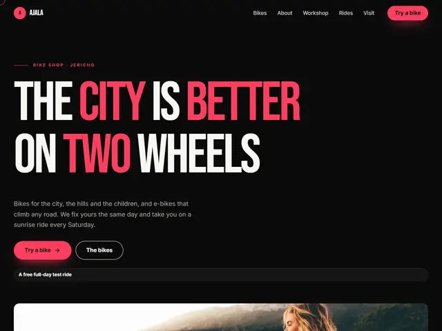

Black, hot coral and cyan, a huge headline rising word by word, bikes passing on a sideways strip and ride times in a table.
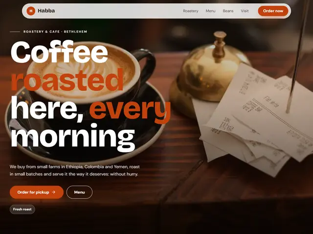

Warm white, burnt orange and petrol green, a full-screen photo drifting slowly, items sliding in turn and reviews running like a ticker.
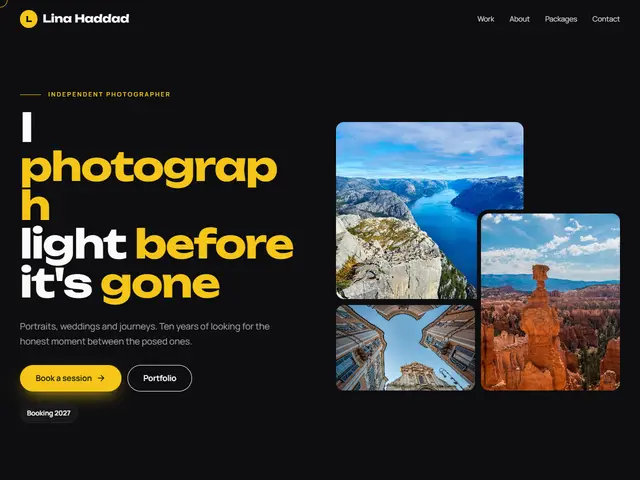

Cinema black, gold and rose, stacked photos moving in depth, the work rolling by like film and one testimonial changing at a time.
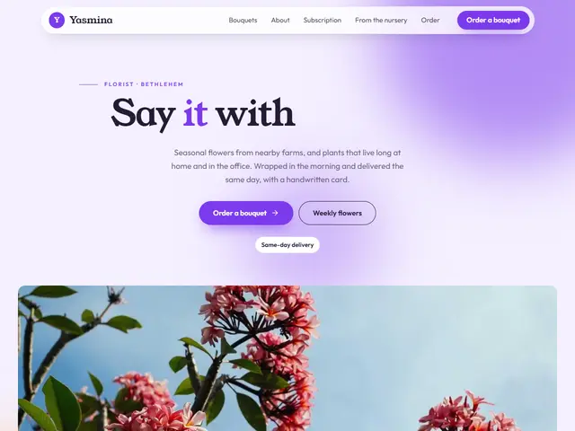

Lilac, violet and amber, colour blobs turning behind the headline like petals, the bouquets on a sliding strip and reviews drifting by.
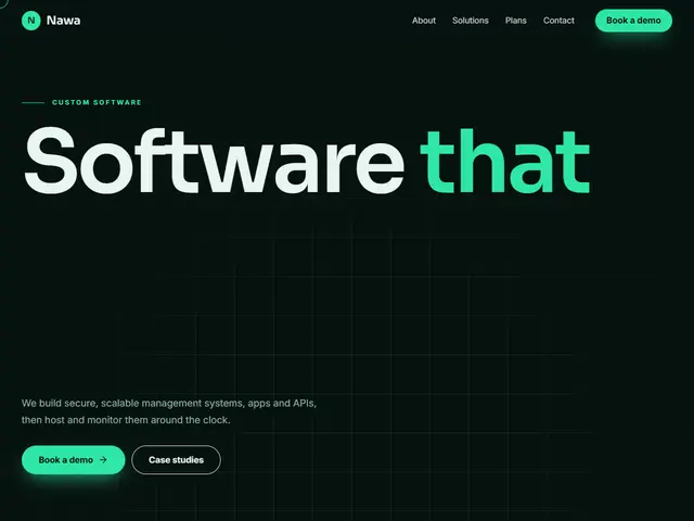

Night green, mint and blue, a faint grid and a full-width headline, services in a bento grid and plans with the featured one standing out.