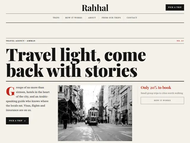

Dispatch
A travel agency presented as a newspaper page: masthead, columns and trips set like the day's dispatches from abroad.
Playfair Display · Source Serif 4
№ 120 · Editorial · Demo for Dive centre
A warm night, brick coral and sage, a dive centre that reads like a sea journal: a big headline over a rule, courses in a dotted list and a wall of reef photos.
Motion: CalmCorners: 0pxDark
Describe your project and the prompt updates as you type. What you write stays in your browser.
# Build a website in the "Deep" style

You are building a production-ready website. Follow the design system below exactly and adapt the content to the project. The design comes from the Qalib library (design No. 120).

## 1. The project

- Name: [fill in]
- Type of site: [fill in]
- What it does: [fill in]
- Languages: Arabic and English: Arabic first (RTL) and a full English version (LTR) with a language switch
- Pages: One page with sections and anchor links
- Contact details: [fill in]
- Assets: No photos yet: use suitable placeholders and mark each one TODO for replacement.

## 2. Visual reference

- Live demo (Arabic): https://qalib.omardeek.tech/demos/deep/ar.html
- Live demo (English): https://qalib.omardeek.tech/demos/deep/en.html

Each demo is one HTML file with all its CSS in a <style> tag. Download the raw file (for example `curl -s <url>`), not a summary of it, and treat its CSS as the source of truth for spacing, sizes and effects. The demo's business and text are fictional: never copy them.

## 3. Design DNA: Editorial

A magazine or newspaper page: huge serif headlines, text columns, column rules, issue numbers, pull quotes and black-and-white photographs.

- **Typography:** A huge display serif with tight leading for headlines, a text serif set in columns, and a drop cap on the first paragraph.
- **Colour:** Off-white newsprint, black ink and one spot colour (usually newspaper red).
- **Layout:** A masthead, multiple columns with hairline rules, a strict grid, headlines spanning columns.
- **Shapes:** No radii, thick-and-thin rule pairs, boxed information panels.
- **Imagery:** Black-and-white or muted photographs with small captions beneath.
- **Motion:** Very calm: simple fades only.
- **Details:** Date and issue number in the masthead, bylines, page numbers, a news ticker.
- **Avoid:** Big colourful buttons, rounded corners, gradients, colourful icons.

**This design in particular:** A warm night, brick coral and sage, a dive centre that reads like a sea journal: a big headline over a rule, courses in a dotted list and a wall of reef photos.

## 4. Design tokens

```css
:root {
  --bg: #15120F; /* page background */
  --surface: #1E1A16; /* cards, panels, alternate sections */
  --ink: #F1EAE0; /* main text */
  --muted: #ADA295; /* secondary text */
  --accent: #E2725B; /* buttons, links, highlights */
  --accent2: #8FA889; /* second highlight */
  --line: #2E2822; /* rules and borders */
  --on-accent: #15120F; /* text on the accent colour */
  --radius: 0px;
}
```

- Colour scheme: dark
- Fonts (available on Google Fonts and fontsource; self-host them):
  - Arabic headings: Amiri (400, 700)
  - Arabic text: Noto Naskh Arabic (400, 600, 700)
  - Latin headings: Playfair Display (400, 700, 900)
  - Latin text: Source Serif 4 (400, 600, 700)
- Type scale: h1: clamp(2.7rem, 6.2vw, 5.4rem) · h2: clamp(2rem, 4.2vw, 3.3rem) · h3: 1.25rem · text: 17px with 1.7 line height (Arabic 18px and 1.9) · max width 1200px · section spacing clamp(72px, 10vw, 136px)

## 5. Page structure

The demo shows a Dive centre. Build the sections with these visual treatments, in this order:

1. **Header**: The logo centred on top with the links in a row beneath it, like a masthead; the call-to-action sits at the end.
2. **Hero**: Like a magazine cover: a huge headline over a rule, then three columns: the lead, a photo and side notes.
3. **Figures**: a row of four numbers with labels
4. **Main offering** «Courses»: a menu in groups, each item with a dotted leader running to its price
5. **About** «About Marjan»: The heading on one side, the paragraphs in two text columns on the other, then a wide photo.
6. **Process** «Your first dive»: a numbered list of rows: title and text, with the price at the end
7. **Gallery** «Under water»: a masonry wall of photos with mixed heights
8. **Pricing** «Packages»: a ruled table: number, title, description, and price or time
9. **FAQ** «Questions»: an accordion of questions with the first one open
10. **Testimonials** «Divers say»: one large centred testimonial at a time, rotating every few seconds, with dots
11. **Contact** «Book»: Two columns: heading, text and address/phone/email with icons; a panel with opening hours and a WhatsApp button.
12. **Footer**: four columns (brand and tagline, page links, contact, social) and a bottom bar

## 6. Motion

Calm: only soft fades (about 1s) as sections enter; no movement on hover beyond colour.

**Decorations in this design:**
- photographs in black and white

## 7. Technical requirements

- **Stack:** Choose the stack that fits the project; prefer static HTML, CSS and JavaScript unless it needs more.
- Semantic HTML, mobile first, adapting at 360, 768, 1024 and 1440px, with no horizontal scrolling.
- Arabic: <html lang="ar" dir="rtl">, CSS logical properties (margin-inline-start, inset-inline-end…), mirrored directional icons, never letter-space or uppercase Arabic, and Arabic text at 18px or more.
- Accessibility: WCAG AA contrast, visible focus states, alt text on images, and all motion off under prefers-reduced-motion.
- Performance: self-hosted fonts with font-display: swap and only the weights and subsets in use, WebP or AVIF images with set dimensions, lazy loading below the first screen, and no heavy libraries for simple effects.
- SEO: a title and description for every page, Open Graph, a favicon, and LocalBusiness structured data where relevant.
- Buttons: WhatsApp links as https://wa.me/<number>, phone as tel:, email as mailto:.

## 8. Delivery

1. Start with the tokens and base styles, then build the sections from top to bottom.
2. Compare the result with the live demo at phone and desktop widths before you finish.
3. Finish with how to run the site and how to deploy it.
Paste it into Claude Code inside a new project folder.
A travel agency presented as a newspaper page: masthead, columns and trips set like the day's dispatches from abroad.
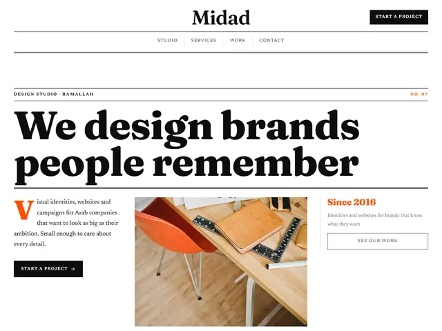

A design studio as an art magazine: huge headlines, one orange and white space.
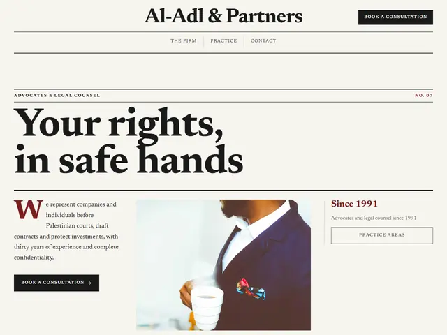

A law firm in the language of serious papers: text columns, rules and a dark red.
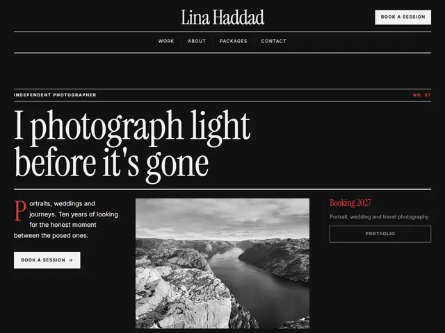

A dark photography magazine: black-and-white pictures, fine headlines and a touch of red.
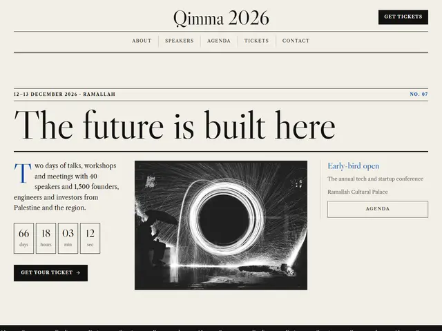

A conference laid out like a broadsheet: an agenda like a news table and a single blue.
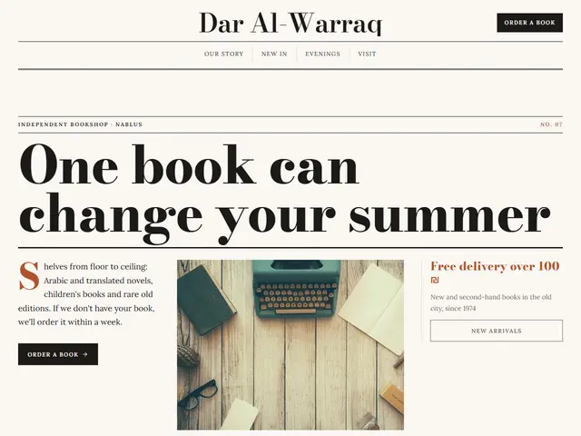

A bookshop as a literary review: an elegant Didone, big photos of books with small captions, and the evenings in a quiet list.
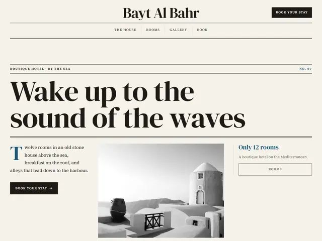

Travel-magazine paper, sea blue and brick red, a cover with a huge headline over a rule, rooms as a numbered list and photos on a wall.
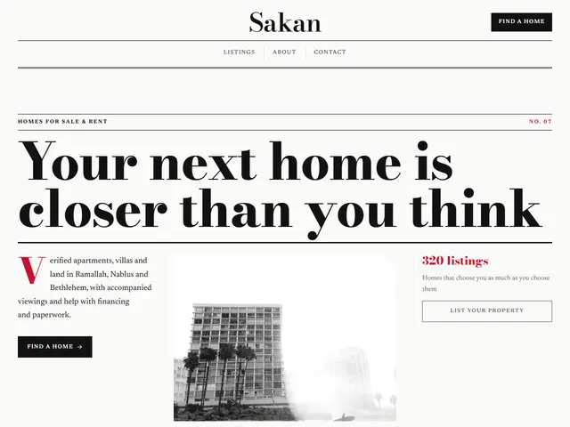
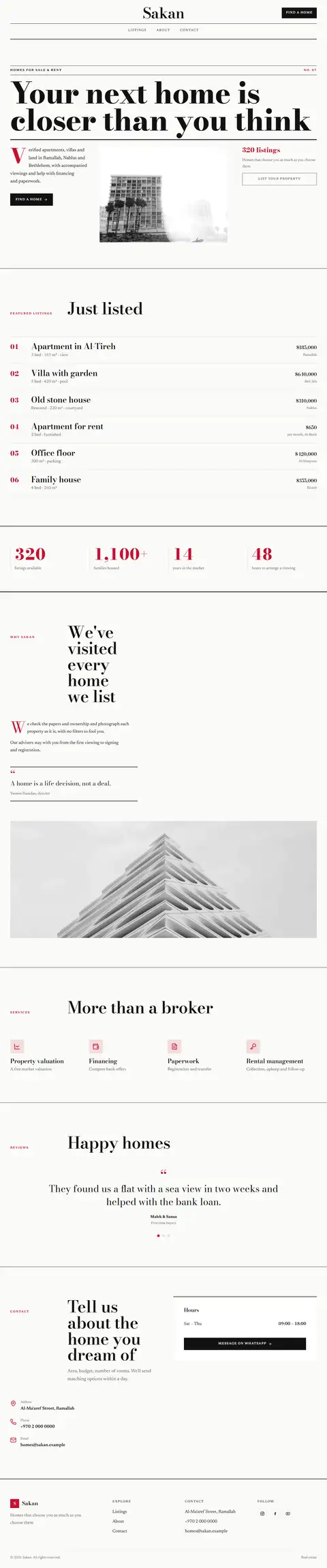
Newsprint white, red and navy, the weekly property supplement: Bodoni headlines and listings in a list like classified ads.
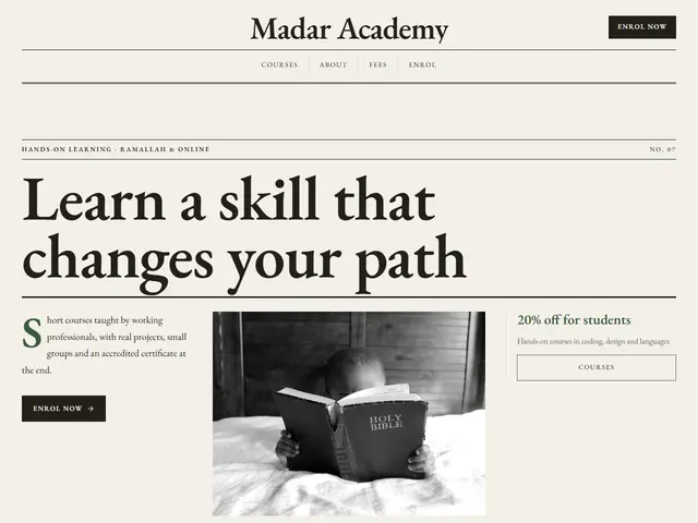

Journal paper, green and red ink, an academy that writes like an editor: text in columns, courses and steps in lists, prices in a table.
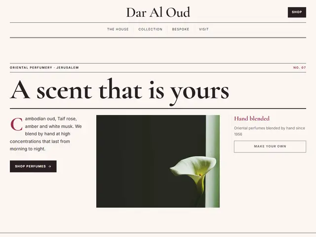

Paper pink, rose red and gold, the beauty pages of a fine magazine: a Ruqaa headline, perfumes in cards and photos in a grid.
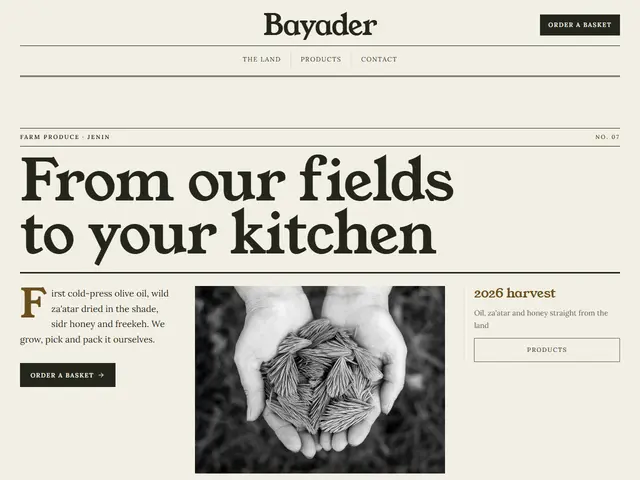

Clay paper, brown and field green, the farmer's almanac: the seasons in a numbered list, the growing steps like an index and figures in monospace.